
The Moment Free Users Decide to Pay.
Premium Subscriber Growth Through Value-Focused Design.
Subscription Conversion Pipeline | Service/UX Design Sprint
Introduction
Problem: Conversion from free to premium remains below stakeholders target.
Many media platforms start free to grow users, then fail to convert them to paid. I hypothesized that one of the main reasons this happens is unclear upgrade value, which keeps conversion rates low and financial goals unmet.Epprentice, a technical and creative video platform, faced this challenge. I led design efforts in a 13-day design sprint to test this hypothesis on their platform. More specifically, I was given the task to design an experience that would allow free users to subscribe and pay a monthly fee upon registration in the signup flow for new users and in the sign-in flow as well as within the product once logged in for existing users. The pipeline needed to highlight what users valued most and it was my duty to find this out.I started this project by building a design plan that mapped the UX process and milestones, showing how each step supported conversion. I was hoping that at the end of this sprint, this plan built a value-focused experience that turned awareness into action and drove steady subscriber growth.
Uncovering What's Valuable
Goal: To begin, I needed to write exploratory questions that would help me find out why freemium users weren’t upgrading. From there, I could uncover what users valued most and what prevented them from moving forward.Methods Used:Desk Research- I reviewed industry reports and media studies to identify proven conversion strategies.- Desk research helped form exploratory questions by revealing patterns, best practices and gaps in current conversion models.Competitive Analysis- I studied YouTube, Spotify and Pandora to see what actions they took to present upgrade value, identify opportunities and find gaps in their current model.- This revealed how leading platforms framed benefits and limited free features to drive conversions.User Surveys- I gathered feedback on content preferences, price tolerance and upgrade motivations.- This ensured decisions were grounded in user data, not assumptions and reflected real attitudes toward paying.
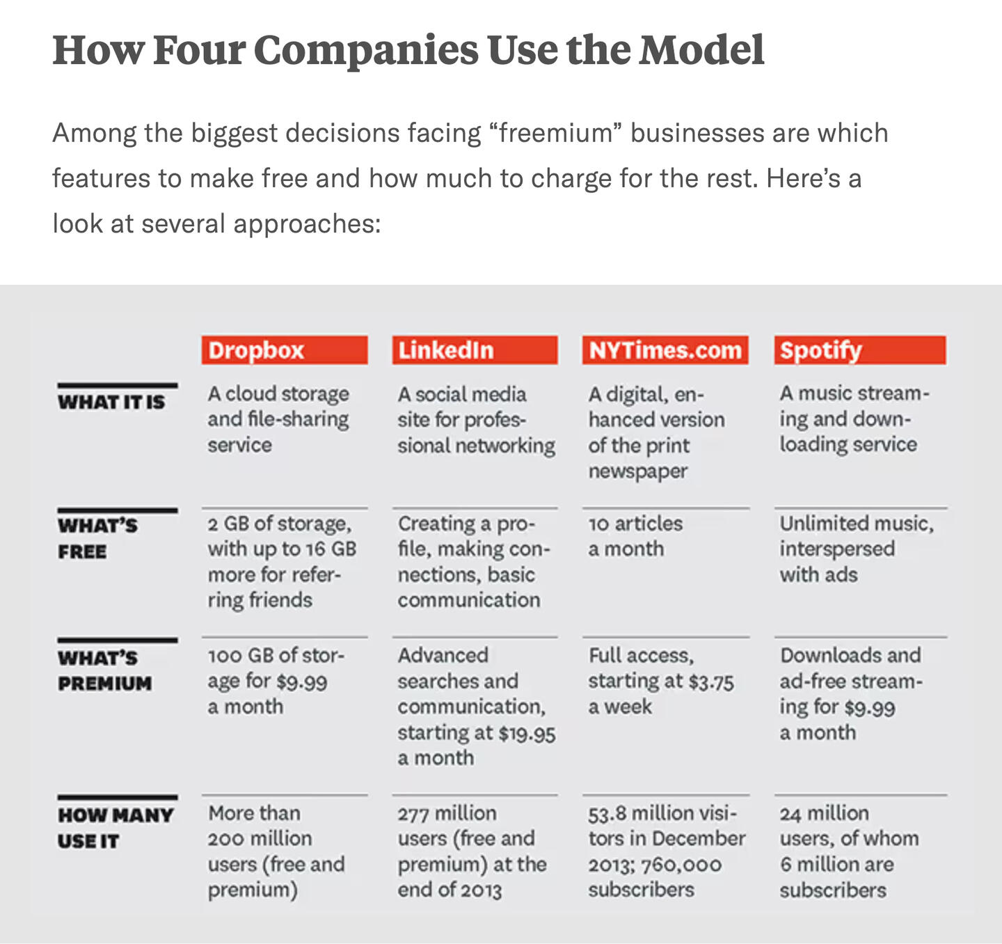
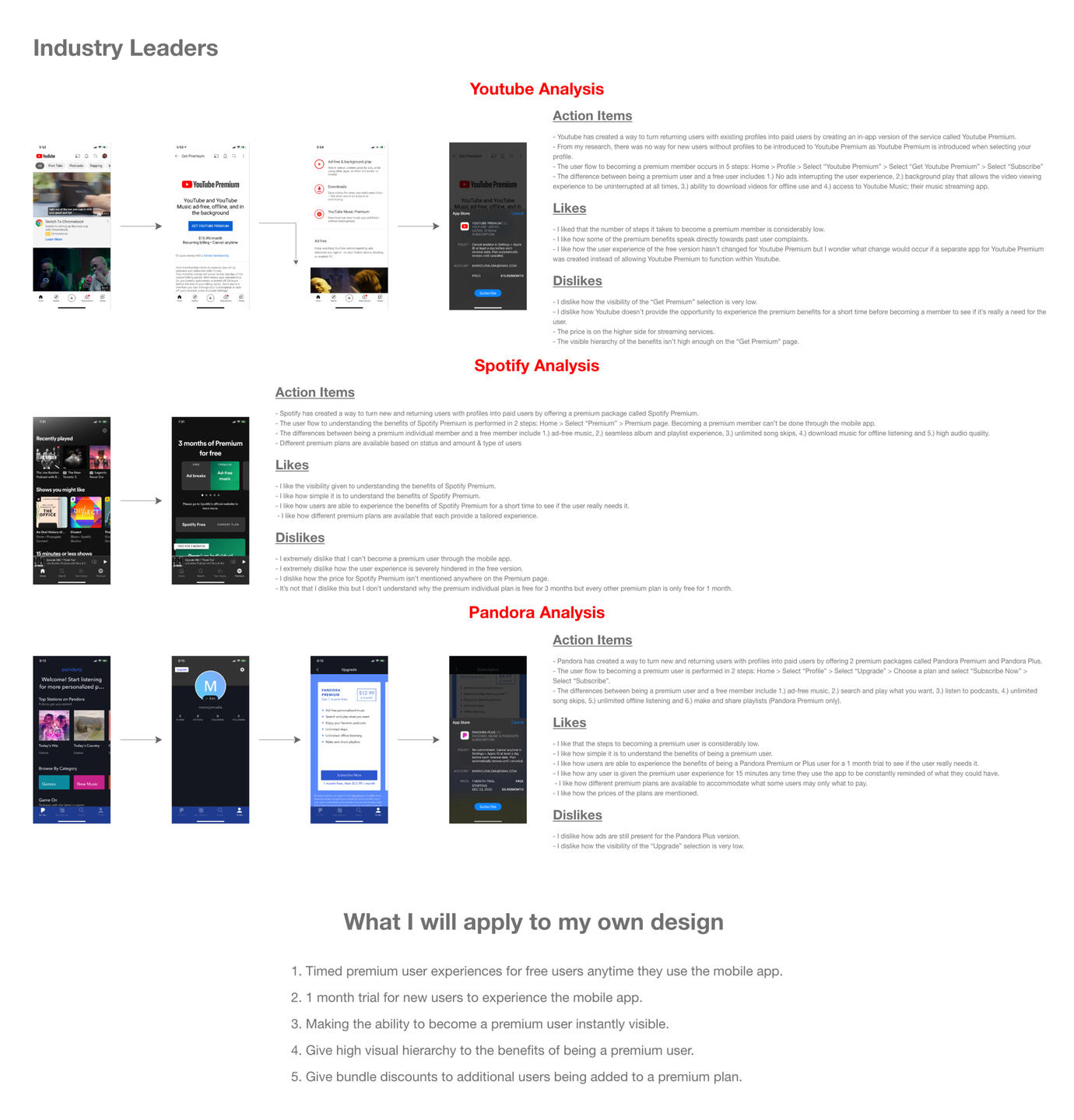
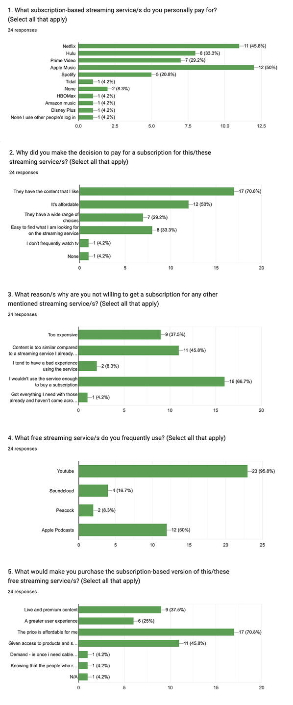
Final Product: The research produced a structured foundation of exploratory questions and supporting evidence for future solution design. Insights from desk research, industry models and user data clarified the behavioral and emotional factors behind upgrade hesitation. Competitive studies of YouTube, Spotify and Pandora revealed how value framing, feature gating and visual hierarchy shape conversion decisions. The exploratory questions were:- What is the most effective way to turn free users into premium subscribers?- Why do some users choose not to upgrade?- What criteria influence a user’s decision to pay for a media platform?These questions now served as the base for building solutions that aligned user motivation with premium subscriber growth.
Finding the Signals that Drive Subscriber Growth
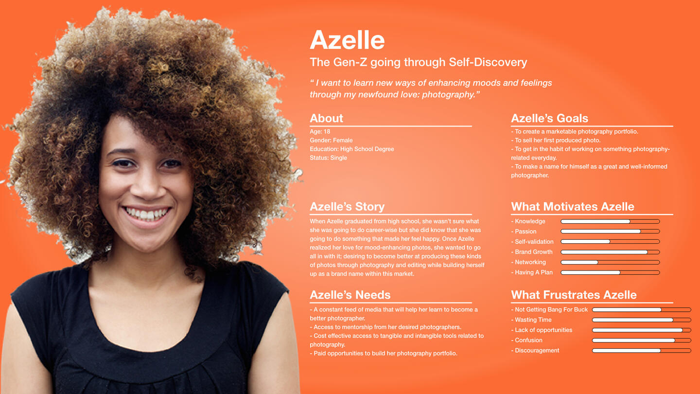
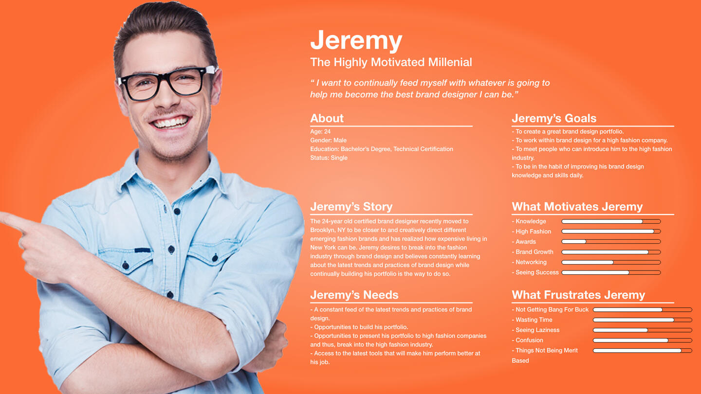
Goal: With a foundation of exploratory questions and supporting evidence established, the next goal was to organize and interpret the research data to identify what mattered most to users. The focus shifted to uncovering insights, defining problem scopes and shaping clear design direction that would inform how free users could be guided toward premium conversion.Methods Used:Affinity Mapping- I grouped research observations and user feedback such as behaviors, motivations and frustrations to uncover themes & insights.- Affinity mapping would expose unseen connections between free feature use, upgrade interest and long-term retention.User Personas- I created personas representing core user segments of the Epprentice platform with distinct subscription-related goals and motivations.- User personas clarified who the design served and ensured future solutions matched user needs and business goals.Problem Statement Generation- I synthesized insights from mapping and personas into clear problem statements focused on conversion pain points.- How Might We (HMW) questions turned complex data into actionable design targets by reframing user frustrations as opportunities for value creation.
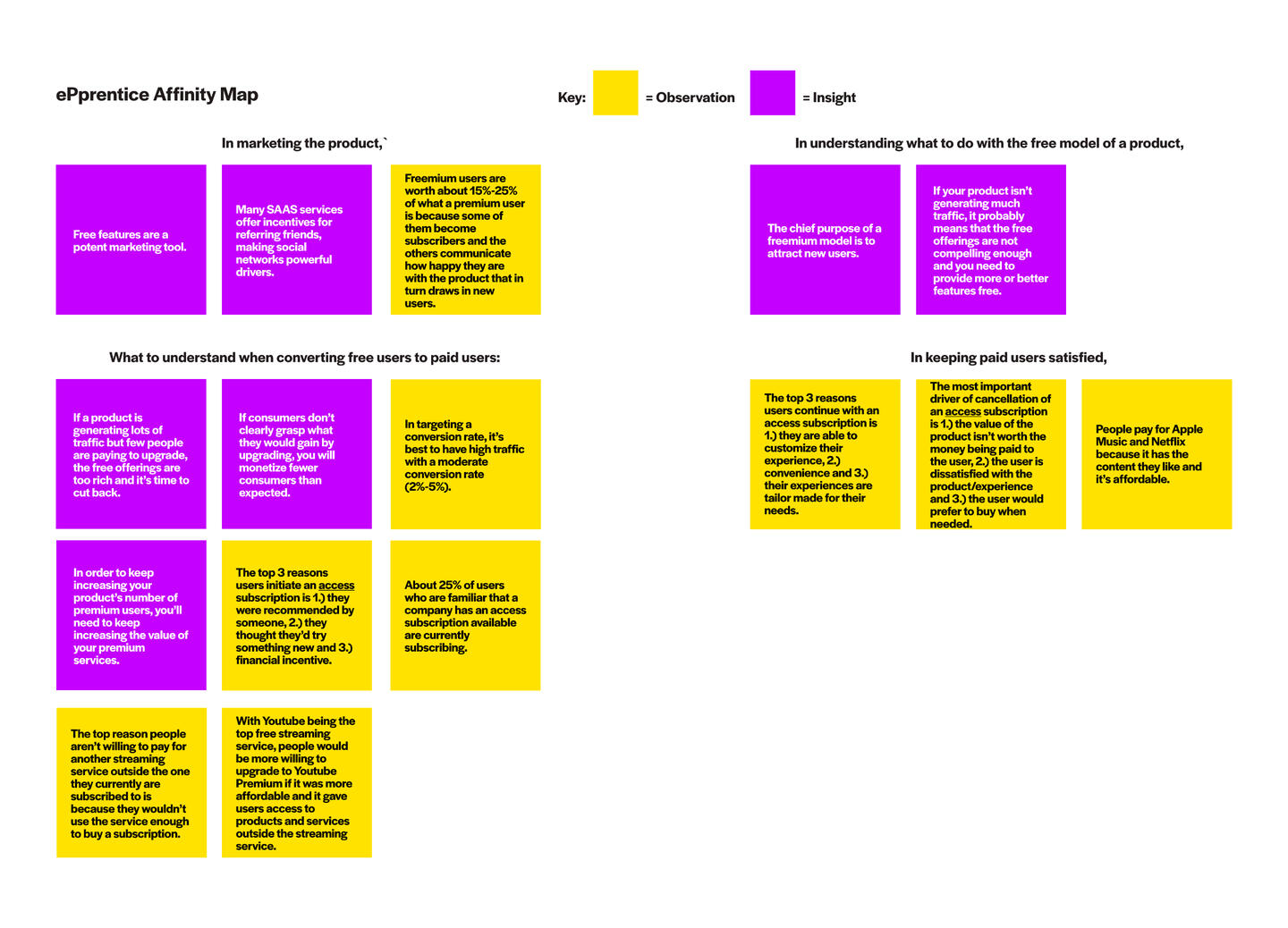
Final Product: The affinity mapping exercise identified seven key insights that revealed how user behavior, value perception and pricing influence conversion from free to premium. These insights guided the generation of How Might We (HMW) questions that would be used to create actionable solutions:
Insight 1: Free features are a powerful marketing tool that attract and retain users.
HMW: How might we design free features that draw users in while still motivating them to explore premium options?Insight 2: The main goal of a freemium model is to attract new users through initial value.
HMW: How might we use the free experience to attract new users and guide them toward premium tiers over time?Insight 3: Users upgrade when they understand clear, direct value in the premium offer.
HMW: How might we make the value of upgrading instantly clear so users see what they gain by paying?Insight 4: Free offerings that provide too much reduce upgrade motivation.
HMW: How might we balance free and premium features to maintain engagement without lowering conversion potential?Insight 5: Personalization, convenience, and tailored experiences drive retention among premium users.
HMW: How might we design personalized premium experiences that feel worth maintaining month after month?Insight 6: Users cancel subscriptions when they feel the product isn’t worth the cost or fails to meet needs.
HMW: How might we maintain perceived value and prevent cancellations through ongoing satisfaction and feature updates?Insight 7: Price and affordability strongly influence perceived value and willingness to pay.
HMW: How might we position premium access as affordable and worthwhile for both early and late adopters?
Simplifying the Path to Premium
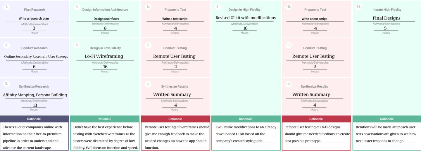
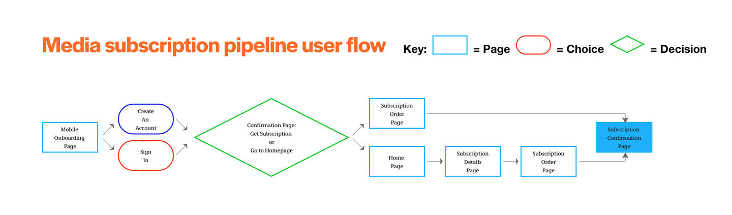
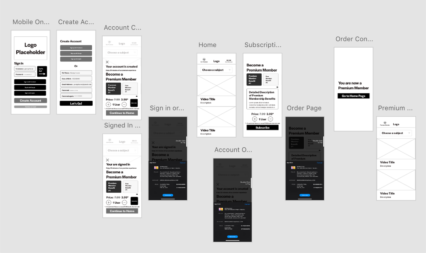
Goal: The goal was to design and test solutions within the subscription pipeline that made upgrading feel effortless and intuitive. This stage focused on turning the pipeline into a streamlined experience where users could recognize value early and move smoothly from free to premium.Methods Used:Brainstorming- I led a brainstorming session to generate solutions as answers to the HMW questions.User Flows- I designed user flows by integrating brainstormed solutions into a streamlined path that delivered information quickly and highlighted premium options early without disrupting the experience.- Through a user flow, I reduced the upgrade process to as few as three steps which created value for both users through simplicity and speed.Wireframing, Testing & Iteration- I translated the streamlined user flow and generated solutions into low-fidelity wireframes to visualize how upgrade prompts, incentives, and content hierarchy would appear across the pipeline. Afterward, I conducted one-day usability testing with five users familiar with streaming services using the 5-step GV interview method.- These methods were used to validate design decisions quickly, identify usability barriers and observe how users reacted to upgrade prompts. Iterating after each session helped refine clarity, flow and placement, ensuring the design supported both smooth navigation and stronger subscription intent.
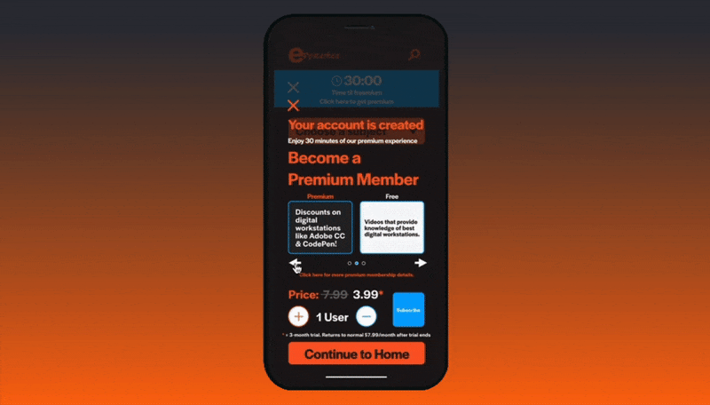
"I liked that free benefits are presented next to the premium benefits so that there is no feeling of guilt for not subscribing."
Final Product: The usability testing provided actionable insights and quantitative metrics that directly informed the final subscription design.Quantitative Metrics:New User Task (Explore the app as if recommended by a friend, then start a subscription)
- Success Rate: 100% (5/5 tester success)
- Average Score: 3.0 (easy)Returning Free User Task (Explore upgrade benefits, then start a subscription)
- Success Rate: 80% (4/5 tester success)
- Average Score: 2.5 (moderately easy)
- Some users struggled to understand price changes and premium timing.Insights:
Discounts and financial incentives encouraged users to subscribe to the premium plan.
Displaying free benefits alongside premium options reduced guilt about not subscribing and built trust in the platform.
Familiar layouts and visual patterns increased comfort, confidence and overall subscription intent.
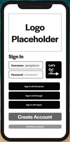
Quick sign-in using social media simplified onboarding and lowered friction for both new and returning users.
Improved visual hierarchy (larger fonts, better spacing and clearer timers) made tasks easier to complete.
Engaging homepage visuals and familiar navigation reinforced credibility and usability.
Clearer subscription details and feedback cues helped users understand the upgrade path faster and complete it with fewer errors.
Iterations:
Increased font size and contrast for key actions to improve readability.
Moved upgrade benefits higher in the layout to boost visibility.
Adjusted copy and button labels for quicker readability.
Clarified trial duration and made premium timing visually noticeable.
Designing and Testing the Epprentice Experience
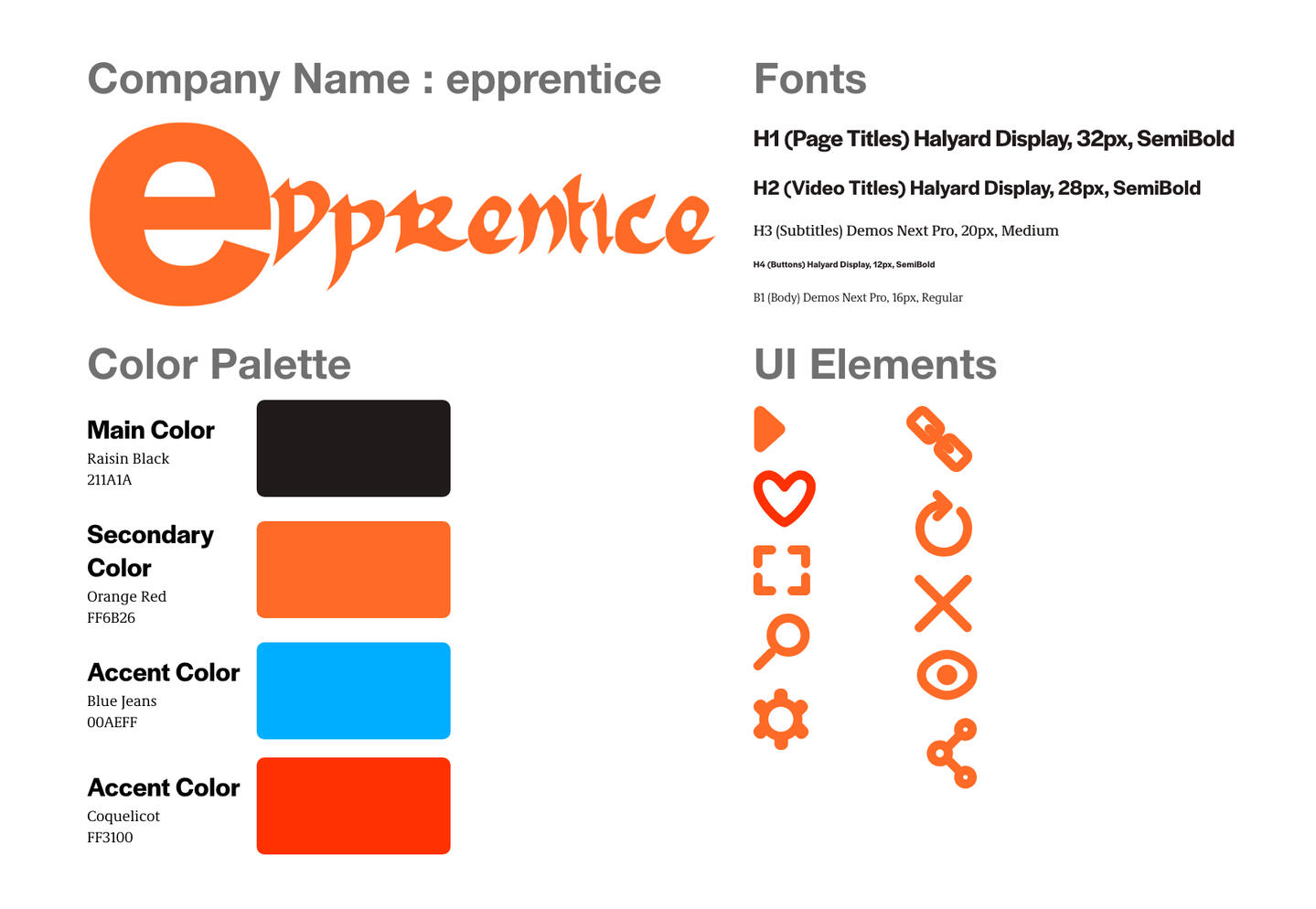
Goal: The goal at this stage was to define a visual identity for our iterated wireframes that communicated value while feeling familiar to users of popular streaming platforms. Testing revealed that users responded best to visible discounts, clear benefit descriptions, familiar layouts and improved hierarchy. The aim was to design visuals that felt recognizable, credible and motivated users to upgrade without hesitation.Methods Used:Style Guide Development- I developed a custom color palette, typography and UI system inspired by the meaning of “apprentice.”- The mix of historical and modern elements reinforced the brand personality of being bold, hip, and smart.User Interface Styling, Prototyping & Testing- I applied the style guide to wireframes to create cohesive high-fidelity prototypes and conducted three remote sessions with users familiar with streaming apps.- The sessions tested how well the visuals communicated premium value, guided upgrade intent and maintained usability across the flow.
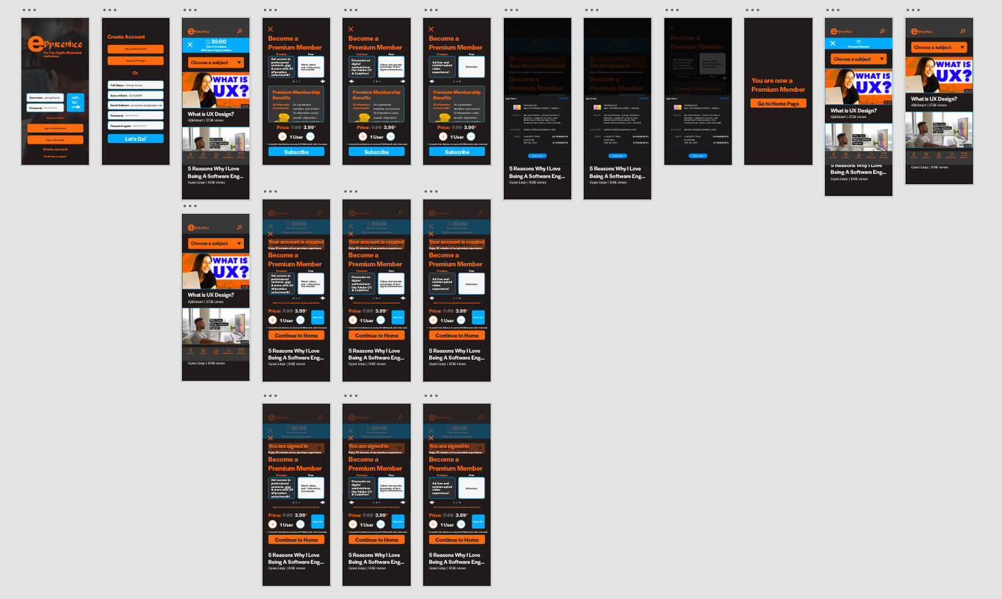
Final Product: The following data summarizes the usability performance and user feedback collected during high-fidelity prototype testing:Quantitative Metrics:New User Task (Explore the app as if recommended by a friend, then start a subscription)
- Success Rate: 100%
- Average Score: 3.0 (easy)Returning Free User Task (Explore upgrade benefits, then start a subscription)
- Success Rate: 100%
- Average Score: 3 (easy)Insights:
Areas that are essential to the tester’s decision making need to be very visible so that the tester won’t have the opportunity to miss it.
When writing a description for a premium benefit, what the tester will gain from becoming a premium member needs to be very clear and given top hierarchy within the description.
Visual elements like color and images can heavily inspire a tester’s decision so they need to be in line with the brand’s personality.

Reflections
This project taught me how to connect user motivation directly to business goals through clear value communication. I learned that users upgrade when they instantly understand what they gain, not when they are pressured to pay. The process reinforced the importance of grounding every design choice in real data from research and usability testing. From this project, I grew to understand:- How users connect with platform value before subscribing.- The role of content exploration in driving confidence to convert.- Deeper understanding of how media platforms monetize.These lessons add to my toolkit as a digital media-focused UX designer and show how design choices can create value for both users and stakeholders.